This is my cover for my preliminary task. at the time i didn't really know how to use Photoshop but i was experimenting with the tools. i think the cover looks really cheep and amateur, i used the s color balance tool on image adjustments to brighten the hair and make it more red. i Also used the transparent tool to make the picture thinner. i used the magic eraser tool to get rid of the background and which made the picture stand out. over all i don't think the cover is very effective and i didn't really know how to use photoshop. I did learn allot about photoshop however so for my Music magazine i knew how to do particular things in order to create a really effective magazine. I found the above cover is really typical and you can clearly see that it is a student piece of work.

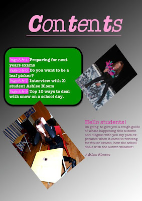
This is my preliminary Contents page. as you can see its really simple and plan. I didn't edit any of the pictures and the fonts are very tacky. It doesn't really draw people into it. i didn't write much and what i did write wasn't particularly interesting. the Background is bland and not effective. I only used photoshop to actually place the layers however i didn't really understand how they worked and what would go in front of what. i didn't use any of the tools and i copy and pasted my writing from word.
I feel like i have improved allot from making my preliminary task as i had allot of time to work with photoshop and truly understand the features. you can see a clear improvement from this to my final magazine and i am now very confidant with photoshop and don't find it difficult to use. i know and feel comfortable with all the different tools and know when they are appropriate for usage.

No comments:
Post a Comment